Category Archives: watercolor art

Daughter Reassembled-An Adoption Search and Reunion Memoir

I usually write about and share my art on this blog, but today I am happy to share another creative endeavor- I published a book. My first book!

I was adopted at birth in 1958, back in the time when closed adoptions were de rigueur. The records were sealed, never to be cracked opened. It was a promise to both parties so everyone could go on with life harboring nary a worry the birth parent or adopted child would come looking for each other.

Fast forward fifty-eight years and the advent of DNA testing. At first, I was just going to find out my ethnicity. I was curious where my people came from, although being fair-skinned with light-brown hair and somewhat freckled, I wasn’t going out on a branch by guessing northern Europe or the British Isles. I took a DNA test and discovered a plethora of DNA cousins. One thing led to another, and soon I was on the trail, ferreting out any information that would lead me to my biological family.

I eventually found and met them, and now have a good relationship with them. My family has grown in so many ways and the journey was amazing. My book is available on Amazon.com.

1 Comment

Filed under watercolor art

Now for Something Completely Different

Butterfly girl small file

I don’t take on too many commissions anymore, but when family asks what can I do? This one was so much fun though. I tried to pull out all the stops.

It gave me a chance to use colors I rarely use in my landscapes, and I also got to experiment with shimmering pearlescent colors. No, I didn’t go buy all those specialty colors for one painting. I used dots.

If you are not familiar with dots, I urge you to buy and try. This is a concept from Daniel Smith. Dots are actual dots of watercolor paint on cards, labeled with the name of the color. You can buy a full set of their colors and try a small sample of each one. The advantage is that you can see the exact color, not a printed or online version of the color. You can see how the paint acts. Some were pretty enough colors, but the paint was not great to work with . Some were so much nicer in real life. I did end up ordering quite a few colors I might not otherwise have taken a chance on.

http://danielsmith.com/watercolor-dot-cards

Included in the set I bought was a whole 8×10 card of all their specialty colors and I had enough to use them on the ferns, the butterfly wings,, the flowers and the shoes. What fun to go wild!

Some of the butterflies are real and some made up. I like to work with detail and so that part, anyway, was right up my alley. I was proud of the finished piece and I rarely say that about my own work. Most importantly, my niece-in-law loved it.


1 Comment

Filed under watercolor art

It takes More Paint Than You Think

Junction sunset tracks first layerJUnction sunset tracks second layerJunction Sunset Tracks

I love a super saturated watercolor like this one. It was fun to paint and a little out of my comfort zone. I first did a simple drawing of the tracks and the horizon line. I didn’t draw the electric posts or the lights because I knew the first washes of paint would set the pencil and I might want to change the placement slightly, so I drew them in after the background was done.

Next I masked the tracks with masking fluid and after it was dry, I started swishing on color. I was working wet into wet, which is great for making color move around, but the downside is that putting that much water on the paper dilutes the paint. It dried much lighter than I expected. After the first layer was dry, I charged the paper with very saturated color without adding very much water. I added some darks at this stage as well. When this dried, I still didn’t think it was still as vivid as I wanted.

In the last stage, I punched up the color even more and darkened the darks to really give it some contrast. Next, I painted the posts and the signal lights. Before I took the masking off, I scrubbed around the tracks to give highlights to the junction area. After removing the mask, I toned down the remainder of the tracks with yellow and fiddled with the details to complete “The Junction at Sunset.”


Leave a comment

Filed under watercolor art, watercolor painting tutorials

Painting Large

Sunrise TreeThis painting measures 35″x13″. Way out of my comfort zone. I usually don’t paint this large for several reasons, the first of which is that my art table isn’t that big. I have to stretch paper this large on a piece of Masonite and work on my kitchen island and I have to work standing up. I hate stretching paper. I get tired of standing up painting. And it takes a lot of paint.

IMG_9387

I love the visual impact of a large painting, but matting and framing are a whole different matter. Expensive. I never would have stretched a piece of watercolor paper this size in the first place, but it was supposed to be a commission piece. Here’s the story.

A client wanted me to paint the Loess Hills view from her house, and she wanted it painted large for her living room. Okay, a sofa-size painting. I had a beautiful antique frame laying around my stockpile at the time. She agreed to buy the frame along with the painting. So I stretched the paper, took the reference photos, and was ready to start the piece, when she called and cancelled the project. No explanation, just cancelled.

Sometime in the intervening years between then and now, I sold the frame. I forgot about the stretched paper until a few days ago when I was cleaning and organizing. I had turned the Masonite over and was using it for a cutting board. I still thought Loess Hills were a good fit for this project, but not her hills.

The tree is one that’s always captivated my attention as I pass it on the Interstate on the way to the city. Mom always liked this tree as well, and so this one’s in honor of her. The reference photo was taken on a sunny March afternoon, not at sunrise. The background is mostly from my imagination. I wanted an impact that the afternoon photo with the blah background just didn’t deliver. I thought that if I were going through the trouble of painting this big, I wanted it to count for something.

It was fun to work this big; I got to use my big brushes. But I probably won’t do it again unless it’s a paying gig. This time with downpayment up front.


Leave a comment

Filed under watercolor art

The “Joys” of Photographing Watercolors

IMG_8518

Eddie's Wreaker

Eddie Johnson Wreaker and Cat

I’ve  been at this photographing my art for online and making prints thing for a lot of years. Never have I enjoyed it, and never has it been easy. It is a comprise at best. Even here I did’t get it exactly how I wanted it.

So what is my method? In answer, I don’t have one, but several, depending on what works and if the sun is out. Back in the days of film, things were even that much more difficult what all with light temperatures and the like. But I will have to say, film had one advantage I’ve yet to see with digital: it did a better job by far with the red/orange end of the scale and also with the blue/turquoise shift.

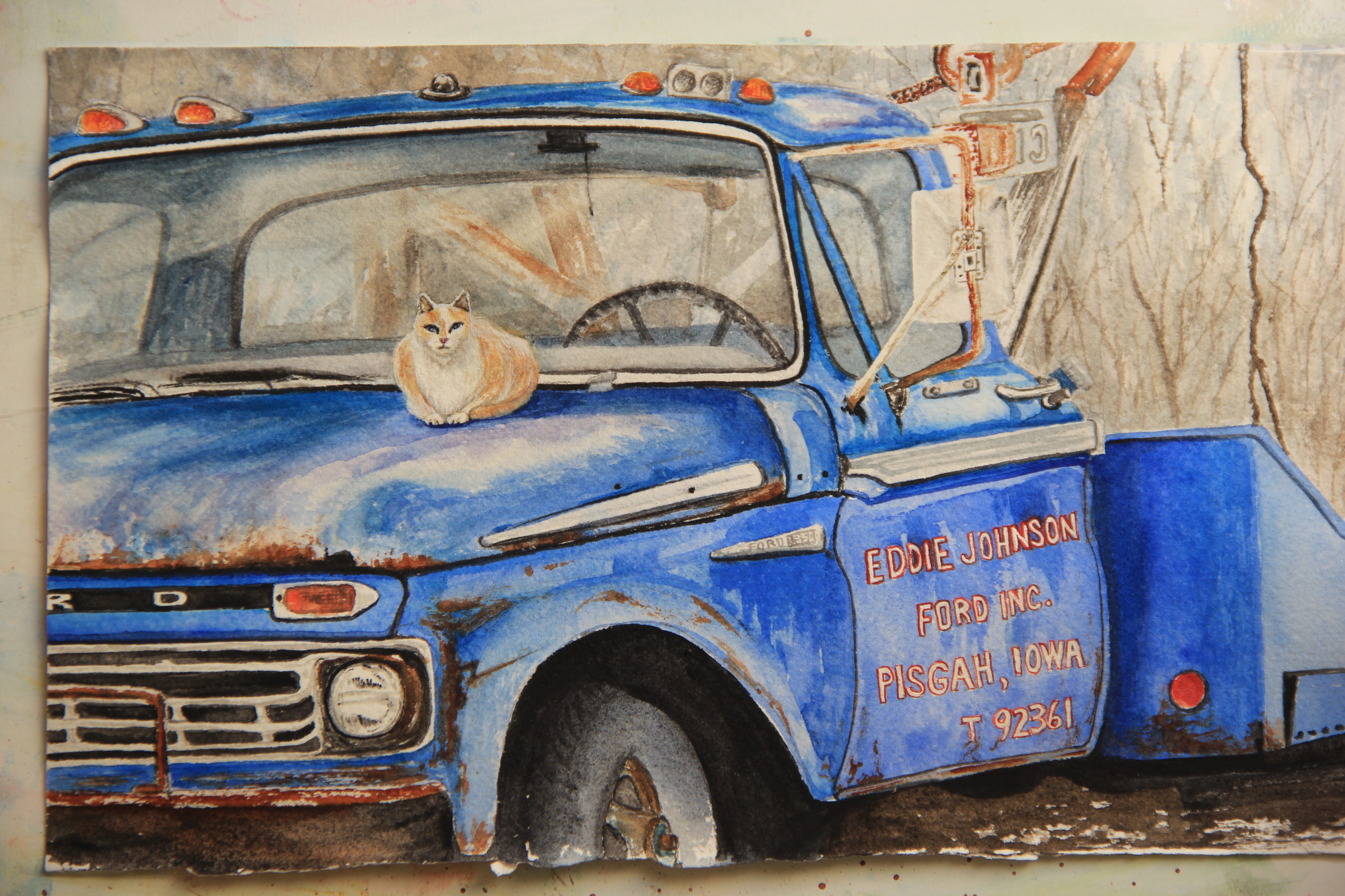
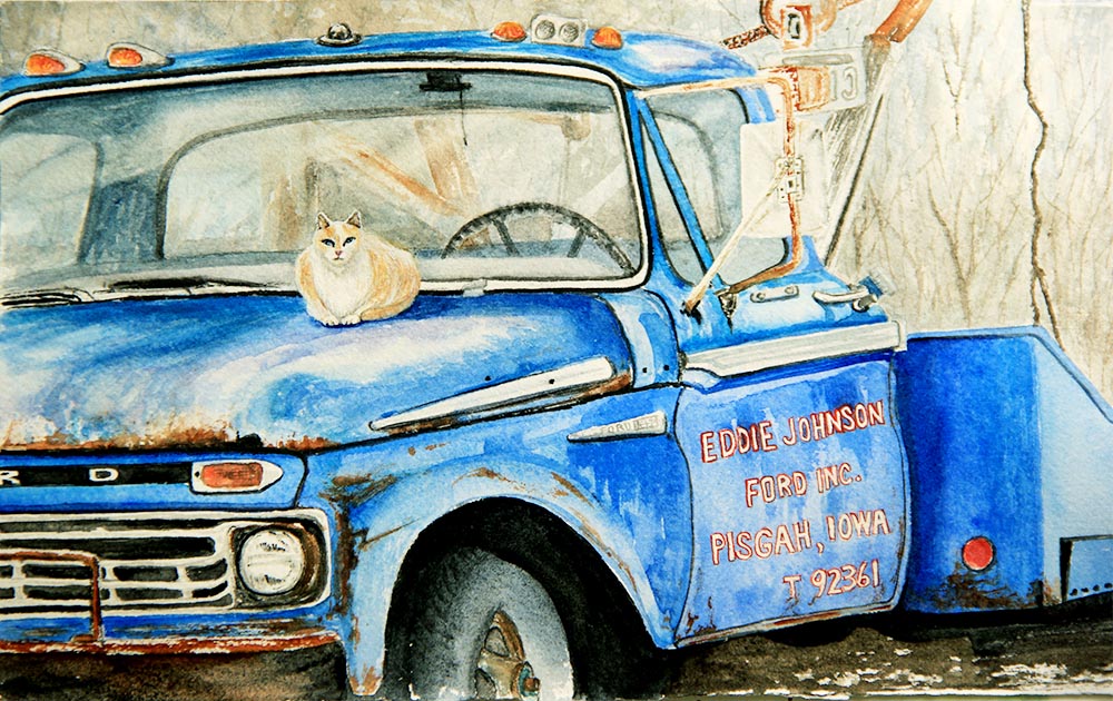
In this example, I used a combination of cobalt blue and manganese (turquoise) blue watercolor on the truck. The photographs I took tended to shift the blues to a violet cast. That was perfect for the background; the first photo’s background is more true to the painting. But the subject was way off. So I imported the photo into Photoshop and bumped up the contrast to match the painting. Next, I used the color correction tool and added more yellow and cyan to get the truck to look more turquoise. This brightened it up and fixed the truck, but I lost detail in the background. If I were going to make prints of this painting or use the photo to enter it in a show, I would not be satisfied with the results above. What could I do to make it better?

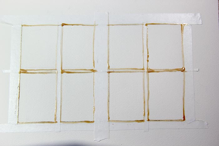
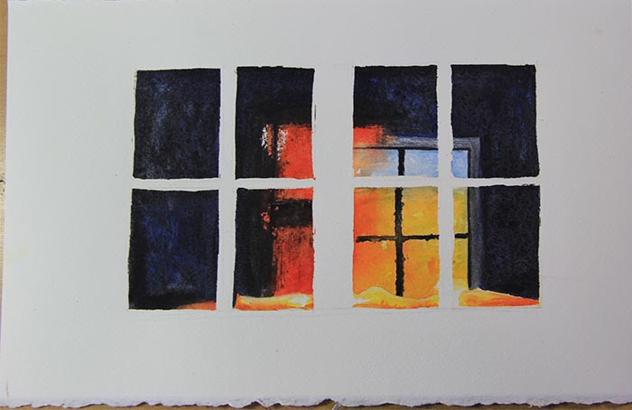
Originally, I took the photo outside in the shade. This was like putting a grey film over the painting and then photographing it. I’ve had fair luck taking photos on cloudy days, but the shade is just not good. Photoshop can correct a lot, but it can’t work miracles.  I’d like to note here, when taking the photos outside or otherwise, I usually lay them flat on the ground rather than propped up. It has to do with the shadows caused by the grain of the paper. If the paper is flat on the ground, it eliminates those shadows.

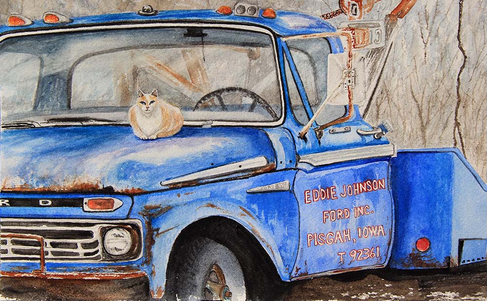
The last photo was taken in the sun on a sunny day. It gave me better results overall. I usually try to wait until I have natural sun to take most of my photos. I still had some Photoshop adjustments to make, but the photo was better to start with so that helps.

I have tried lights, but never with any better results than natural sunlight. Besides, they take up space and are awkward to set up and take down. I just didn’t care for them. Traditionally, I’ve always used my Canon SLR camera with a telephoto lens to correct for keystoning. Keystoning is the distortion caused by wide angle lenses and will make your painting look like a trapezoid rather than a rectangle.  When photographing, I try to visually line up at least one edge as straight as I can in the view finder. If I’m off, this can be corrected in Photoshop, by turning the photo by degrees or cropping.

Lately, I have also had really good luck with the camera in my I-phone 7. It tends to make the painting a little more contrasty. This can be helpful sometimes and shows me where I might want to add more contrast in the painting in reality. The thing that the phone camera excels at is being able to take photos in just about any light and having them automatically temperature corrected. I still import them into Photoshop to fine tune, or even use the camera’s editing tools. One thing the phone camera has a hard time with is the soft delicate washes I use so often. In this case (with the truck) I had terrible results with my phone camera, so I did use the Canon SLR.
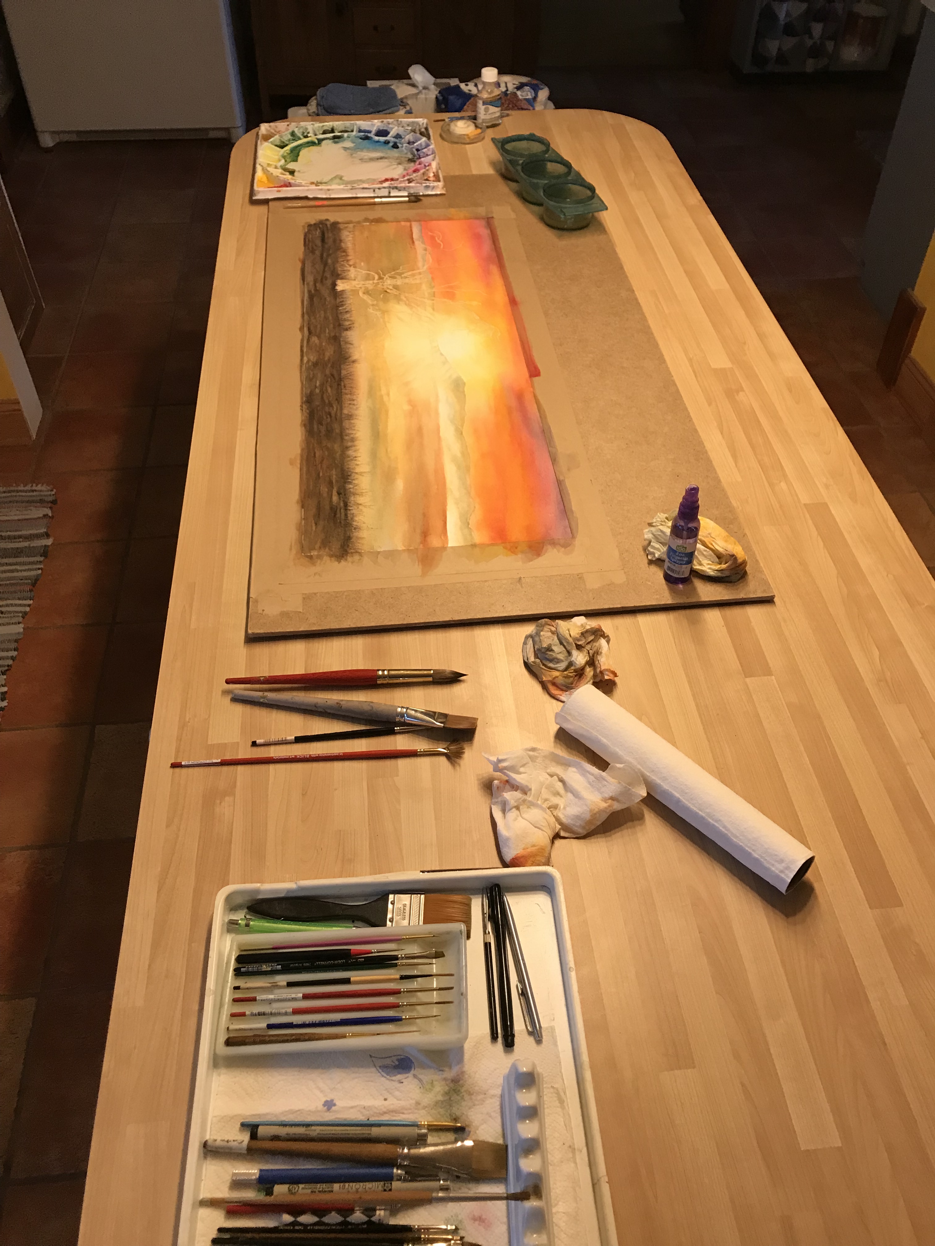
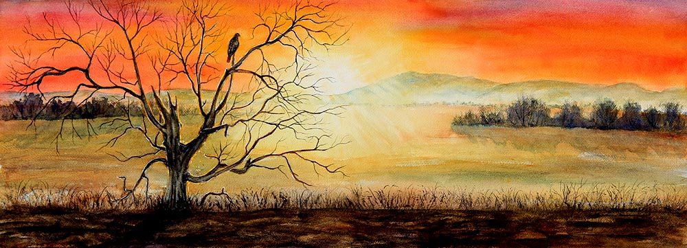


Leave a comment

Filed under watercolor art

Goats with Heads Like Bicycle Seats

Goats

These are my neighbors goats. I don’t know much about goats, but I thought this was such a great pose. I didn’t even notice the fourth goat in the barn until I was studying my reference photo, taken some years back, and saw him peaking out. I don’t paint animals very often, so I set myself a challenge with the goats. My daughter asked about the short ears so I looked it up and apparently these are Lamancha goats. All I know is that when I was drawing them, I thought it was remarkable how their heads reminded me of bicycle seats.

It was a pretty straightforward transparent watercolor, the white is the white of the paper. The hardest part was getting the proportions right in the drawing. After that, it turned out to be a fun painting and I might have to try animal paintings a little more often.


Leave a comment

Filed under watercolor art

Missouri River Valley

Field of Curly Dock

Yay, a painting without masking fluid! While it has its uses, I would rather just paint than go through all the rigmarole of using masking. This is a typical Missouri River Valley scene: cornfield in the distance, farmsteads and Loess Hills in the background.

I pass this few acres of CRP ground on my way to town every day. I love how it changes from year to year. Sometimes it is curly dock, like above and sometimes it is sunflowers.  I don’t always use all the colors on my palette, so this painting afforded me the opportunity to play with some Indian Red and Venetian Red to capture the velvety texture and color of the curly dock. Both of these reds are semi-opaque and sedimentary, so their use is limited, but proved perfect for this job. Most of the time I like to stay with the clear, transparent colors. The difficulty here was moving between the red and the green without mixing them too much because, as they are complimentary colors, it would turn to mud.

When I finished this painting, I still wasn’t quite satisfied. I couldn’t figure out what it needed until I studied it for awhile. The answer came to me in the form of cropping. I put a mat on it and cut off a good deal of the foreground, which was green, and it instantly improved the painting without adding another brushstroke; even the proportions are better.


Leave a comment

Filed under watercolor art

A Lesson in Masking a Watercolor

Window Sunrise

The finished piece above is a morning sunrise as seen through the windows of our old city hall building across the street from me. I loved the reflections and geometric shapes. I knew it would be a challenge to paint the reflections, so I started with them first. In order to paint freely across all the windowpanes leaving the white of the paper, masking was in order.

Window masking

As I planned my approach, I knew that using tape would produce a straight, clean line and best protects the paper. If using masking fluid, sometimes it doesn’t cover and you will discover unwelcome surprises of dark paint where you do not want it. When criss-crossing tape, there is a danger of paint bleeding where the tape meets in the corners as well. Because the windows are old and they have glazing compound along the edges, I didn’t want exactly straight lines, so I first applied the tape, then laid a thin line of masking fluid along the edges. This served two purposes, to give it an uneven edge and to prevent paint from bleeding under the tape.


Window mask removed

I then painted the inside of the windows, having fun with the reflections and dark background. When the painting was completely dry, I carefully removed the tape and masking. When possible, I try to pull the masking off rather than rubbing it with a rubber cement pick up because as you paint, some color will stick to the masking fluid. If you rub it, the rubber cement pick up will sometimes smear the color onto the white paper.

At this point, I redrew the lines with a triangle and T-Square. Pencil lines are usually lifted along with the masking. Then I covered all of the white area with a light wash of blue with just a pinch of rose. Even though the building is white, it is in the shade so I toned down the pure white. It is good to note here that once pencil lines are painted over, it is pretty much impossible to erase them. After that it was just a matter of filling in the lines and shadows to complete the piece. Even though I use a straightedge to draw the lines, I freehand paint everything. It isn’t an architectural rendering; it’s a painting, so I like the hand-painted look.


Leave a comment

Filed under watercolor art, watercolor painting tutorials

Winter Work

Winter Work

One of my goals when I started my Home Range project was to do paintings that didn’t look so much alike. Most of my plein air work had been painted on sunny, summer mornings. This is definitely not a summer morning.  It is a dreary, cold winter day.

I live a half block away from this grain elevator and have noticed the guys working over there, moving either corn or soybeans from the big storage building over to the elevator. It makes me glad I am warm and cozy inside working on painting instead.

Another goal I had on my list, was to plan a painting rather than finding a scene and rendering it. To that end, this painting tells a story. I used several reference photos to piece it together. One photo had only the blue and white wagon, one the figure, and another the wider view of the scene. Because the inside of the elevator would turn to black in those photos, I also had to get up close and take more photos of the interior.

I added the birds (since there are always pigeons over there) and the smoke to give even more life to the scene. I also did a little experimenting with a wax crayon as a resist on the foreground and I was pleased with the results. I liked the limited color palette with just a touch of primary color. There is a lot going on in this painting, but I think it still works.


2 Comments

Filed under watercolor art, watercolor painting tutorials

Another Practice Sketch

So a little more fun with pre-painted backgrounds. This is a view of DeSoto Lake from the DeSoto National Wildlife Refuge Visitor Center, within five miles from my home. Right now there are thousands of Snow Geese, Canada Geese, and Trumpeter Swans on the lake. On a drive yesterday, I saw a flock with more than thirty Trumpeter Swans. I have never seen so many swans at one time.

One of my struggles is adding figures and wildlife into my paintings. It is one of my goals, therefore, to work on that over the course of the next year. Robert Wade says once you do a thousand or so of these little sketches (he was talking about figures) you will start to get the hang of it. So I better get cracking.

I was pleased with the Canada Geese, but I felt they were a little big in proportion to the river pilings. Next time I will keep that in mind. Good lesson. I was pleased with the trees anyway.

Leave a comment

Filed under watercolor art, watercolor painting tutorials